
Tags
SEE EDIT BELOW THE GALLERY!!
I’ll edit this post later and add an explanation. Here’s a crappy end to my crappy week.
-

- Ideas from my sketchbook.
-

- One page of logo ideas after hours of Illustrator.
-

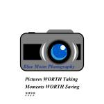
- Logo Draft 2.1
-
- Logo Draft 2 copy 1
-

- Logo Draft 2 copy 2
EDIT: Alright, I’m keeping all the stuff I originally posted (i.e., the first two pictures in the gallery and my two-sentence rant above), but I’ve finally updated!
My first thoughts were to incorporate my name or initials into the logo somehow. I’ve always really liked my name and been fascinated with all the different ways it can be written. I was inspired by these sites, and also the concept of spinonyms (on the link, second-to-last on the list). After talking with my awesome mom some more about different logo ideas (and showing her my initial ideas), she suggested trying something without my name or initials. So I thought about what I would want to design a logo for that would still say something about me. I thought about doing a pun on my last name (my dad has quite a few), but couldn’t mold any of the puns I came up with to fit a business, so I dropped that idea.
I brainstormed lists of things that I could do/produce that would have market value; it was sort of like designing a logo for a small business that I might start. My main ideas were a small, personal music label (since I’m a singer), or a photography business (as I mentioned in my Graphic Collage posts (both draft & final), I’m an avid photographer. Also, to make the logo even more about me, I included the “blue moon” in the lens, because I was born on a blue moon. So that’s how I came up with Logo Draft 2.1. The camera design was inspired by this image., since it already had a moon shape in it. (Albeit a crescent moon… Being the stickler for details that I am, I couldn’t stand to misinform people by showing a blue crescent moon since blue moons are, by definition, not crescent.) Then, I wasn’t sure if the “moon” in the lens was obvious enough, so I added some speckles to the lens in “copy 1”. However, I think that just makes the lens look dirty when the logo is small – it’s just too detailed for scaling; but I thought I’d put it up anyway. After showing this new design to my mom, she suggested making the camera design simpler (see “copy 2”) – again, this would make it a lot easier to scale.
By the way, the “Pictures WORTH Taking / Moments WORTH Saving ???” was just two ideas for a tagline (and to connect it back to me some more – I couldn’t resist a name pun!). It’s not part of the logo, I just forgot to turn off the visibility before I exported the JPEGs.
Commenters, please let me know if you like “Logo Draft 2.1” or “Logo Draft 2 copy 2” better! I’m also thinking about doing a logo that is just the camera lens, but that version isn’t quite finished yet. Maybe it could be my secondary logo…
Cheers,
LW
P.S. For anyone wondering why I ask for my mom’s advice so much, here’s a couple reasons:
- She’s a graphic designer with a lot of experience.
- She’s designed logos for other people/businesses, as well as her own logo for her jewelry business.
- Most importantly, she’s my mom & I respect her opinion & advice!

it’s so crazy that we both did photography! i like how you added the detail about the blue moon; it adds another layer of personalization, and it adds that pop of color. a suggestion would be to make the font a little bigger, maybe ‘blue moon’ above ‘photography’? that will make it easier to read when scaled super small, and a bit clearer if you keep it that shade of blue. i would also maybe change the font color to a deeper blue (maybe navy), and make ‘photography’ a different color entirely; that way it pops more. if you go with your second draft, i would also add a border around the camera shape to make it stand out a little more and add another layer of cleanliness. overall, you have some really great details and elements, and it’s a really good draft! i can’t wait to see the finished product 🙂
LikeLike
Personally, I like the 2.1 version better because it looks to be done a lot better than the other version. I like how you implemented different 3D schemes to it so I would keep that one. I would however change the text to something more sophisticated and professional just so your logo stands out a lot more. Other than that this was a pretty good start, nice job!
LikeLike
A big thanks to those who gave feedback; I’m definitely taking it into consideration! I think I’m going to go with the 2.1 version of my logo – at least for the camera part. I’ll also darken the font for “Blue Moon Photography” and change the font size for all or part of it. I’ll also experiment with the placement and size of the words to try and achieve a better sense of balance. Lastly, for my final draft I’ll make sure to remove the tagline.
LikeLike